With the outside world being partially closed, this year we found ourselves evermore present in the digital universe. This was an immense opportunity for the organizations looking to step up their digital experiences, as well as for those brick-and-mortar businesses who transitioned to the online environment and switched from struggling to survive to thrive within this context.
Reflecting on some of the product design practices that lift the bar in 2020 in terms of innovation and efficiency, in this article I am going to present what are, in our opinion, the web and mobile app design trends for 2021.
As it is difficult to pinpoint exactly which of these trends are going to perform better, we advise that you don’t take the following list as a leaderboard, but rather as inspiration, an appreciation of what it is believed that will dominate the screens in the upcoming year.
Dark Mode.
We’ve all got excited when Apple introduced this feature. Being so widely adopted by most of the users in no-time, it became the norm for big tech companies such as Facebook, Instagram, or Slack, as well as small businesses looking to spice up their digital identities.

Users seem to find the dark theme adding up a nuance of coolness to their devices, but besides this aesthetic factor, there are a couple of other reasons why this feature has been so requested recently and why we think will continue to dominate the UI guidelines.
· It reduces eye strain
· It provides safety in dark environments
· It allows highlighting and popping other design elements
· It saves device battery power
If you are thinking of adopting this trend for your digital experience too, there are some things that you should keep in mind so you can make the most of it:
Use a dark grey rather than a pure black (#000000); use lighter tones on dark themes, as saturated colors can create an irritating contrast on your UI; test your design in both dark and light appearances and allow your users to switch between regular to dark themes, rather than framing it as the only option.
There are more technicalities behind the simplicity of this sleek feature, but for that, we suggest that you read Nick’s Babich 8 tips for dark theme design.
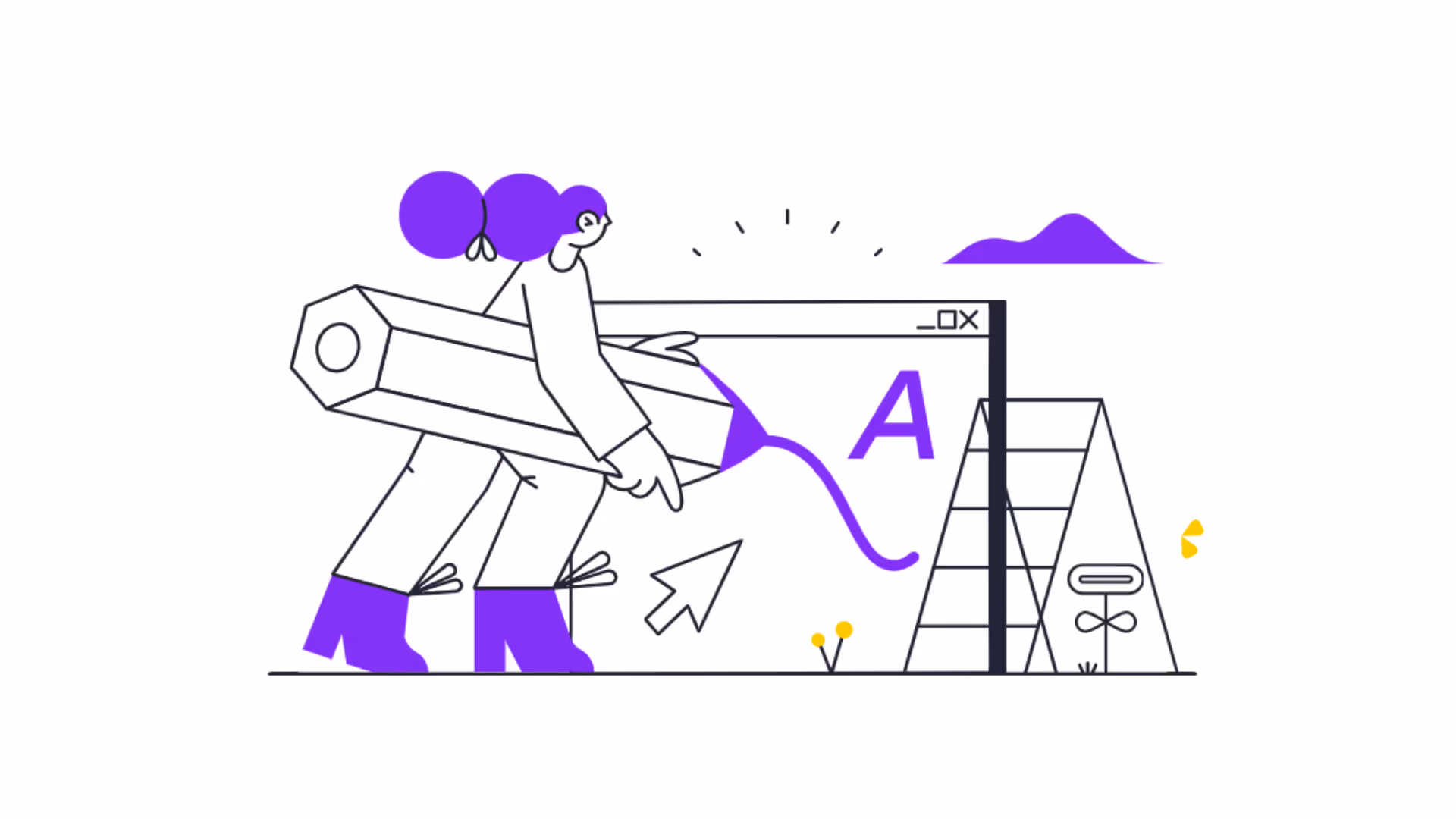
Bold Typography.
Yet another design trend that seems to have found its way back into widespread practice nowadays, bold typography perfectly blends with pretty much every trend that this article will touch upon. Not only does it add an extra feel of modernness to your overall design, but it also an efficient means of driving users’ attention to certain elements on your web or mobile app.
Remember that when playing around with such heavy fonts, you should avoid overusing them and focus on short bits of text placed on more neutral backgrounds.

Micro interactions.
Micro interactions have become an essential part of designing great web and mobile apps. Being utterly subtle details, these design gimmicks articulate an enjoyable experience and ignite a priceless sense of excitement for those using your app or navigating your website.
Although the term might seem quite explanatory itself, one must remember that the word “interactions” refers to engaging human moments, that can be grasped within seconds, without overwhelming.

Beyond conveying an aesthetic aspect, these animations aim to:
· Provide immediate feedback about a completed action, playing on our natural tendency to seek instant gratification in everything we do;
· Teach the functionality of the visual interface through intuitive design elements.
· Or encourage certain actions on the platform, functioning just like a visual Call To Action, but rather an indirect one.

Whether you are thinking of a swipe animation, an unconventional loading screen, a delicate call to action, or just a cool button, when designing these micro interactions, you should always put yourself in the user’s shoes, strive for functionality, be as less intrusive as possible and use plain human language.
Neumorphism.
Designers from all over the world seem to have not got over this trend which is somewhat recent, making most of the lists of 2020. Still, researching it could get a bit confusing because some tend to state that neumorphism is just a more recent term coined for skeuomorphism.
But there is a difference.
Skeumorphism, implies designing elements in a realistic and minimal style, focusing on the similarity between the real and digital worlds.
While neumorphism also attempts to replicate the real feel and aspect of elements such as buttons, layouts, or cards, it is more focused on the color palette. Specifically, this trend refers to creating an interface in which the previously stated elements look like they are placed behind the background, and not on the background.
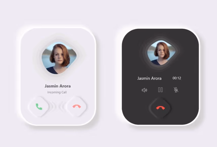
This is a subtle touch that can be done by manipulating shadow and light.
The image below should be explanatory enough, but if you want to get a crash course into how to properly implement it, we suggest reading this neumorphic design guide.

Immersive 3D visuals.
It is still quite early to tell if VR and AR technologies have gained a maturity level, but what is noticeable is that an increased number of product designers are pivoting similar hyper-realistic visuals onto websites, as well web and mobile apps. This gives brands more immersive touchpoints, an awe-inspiring user experience that could easily translate into conversions.

Successfully jumping on the bandwagon with this trend implies, however, a fine eye for design, but also a series of diligent efforts to increase your website performance. You may have some sleek animations or a 3D visual ready to take up the entire users’ screen and amaze them, but a slow-loading and poorly optimized platform will have them leave your website even before that fancy hero image will pop up, so be mindful about it.

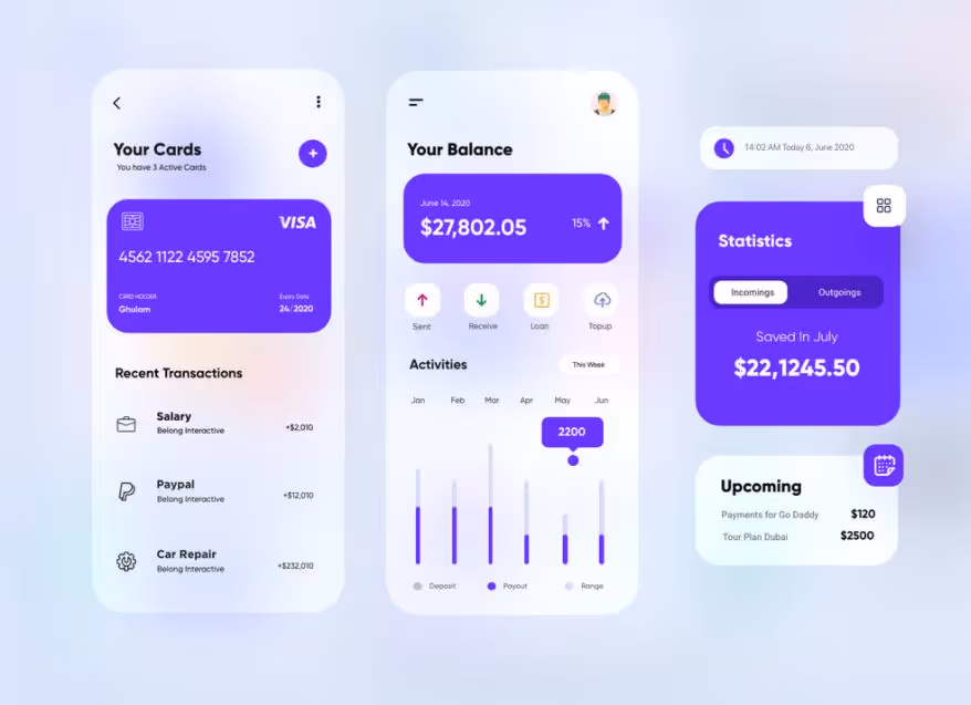
Abstract data visualization.
With so much data being available online, cluttering both our feeds and our minds, it is imperative that you find more engaging ways of displaying it. Gone are the days when we would get excited glancing at a colorful infographic, consuming the information with more curiosity than we would from a dull spreadsheet.
Indeed, it was exciting to see this abrupt transition from plane tables to creative data illustrations, but just like with every visual feature, we seem to have got used to this too now.
You have to find novel ways of data visualization. Dare to illustrate your information abstractly with a futuristic design that doesn’t necessarily conform to some predefined patterns. Challenging the norms might sound cliché, but when it comes to design it is how you move forward.

Microcopy & UX writing.
Talking about plain human language, there’s not much to discuss about it, but a simple statement. People demand less jargon, less of those vague standard notions, and more copy that sounds human. The goal is to write as you talk, ideally as less formal as possible, similar to a casual dialogue that you would have with a friend.
Although we were not the fans of the term “human-centered design”, as it kinda feels like BS, to our surprise, it is a thing now. And so should the human-centered copy.
It doesn’t matter whether you are writing an article or UX copy for a new fintech app, you should aim to define a unique tone of voice, based on authentic non-corporate messaging that people can understand and resonate with. Being a content writer myself, I have often fallen into the trap of wanting to sound just as professional as the other players in the industry, but, looking at the engagement metrics, I got to understand that I was heading to a dead-end.
It is fascinating how challenging it is to write just as simple as we talk when most of us were schooled in a specific formal writing style, but, luckily, there are some organizations that are already mastering this art.
Have a look on Ueno’s website to draw some inspiration on what engaging UX writing looks like.
Minimalistic design.
We can’t be sure whether this is just a temporary phase or a long-awaited comeback, but it is clearly happening. With so many distractions, flashy elements, electrifying colors, and nerve-racking pop-ups, going back to the basics of minimalism feels like a refreshing breath of air for most of us who need a break from the distractions of the current always-on life.
Having just mentioned that you should dare to be bold in your design and play with the abstract notions, it might seem a bit contradictory to now encourage you towards minimalism.
I’m not saying you have to ditch your experimental ideas to the detriment of a bare design. What I am suggesting is that you can do both. Simply keep in mind that, these days, as users, we tend to feel overwhelmed and anxious by the clutter we are surrounded with.
No matter the industry, a loosen-up visual interface will trigger a sense of peacefulness which often correlates with increased levels of engagement. Still, this practice is even more effective for those businesses selling complex solutions such as SaaS products or even financial services, as it simplifies their narrative, keeping users hooked on the specific platform.
Final thoughts.
The web and mobile app design area is crowded with ephemeral trends, but some of them determine the industry norm for a longer term. In this article, I wanted to present the popular design trends of 2020, while also anticipating a few more that will gain increased traction in 2021, based on our work here, at RebelDot, as well as an analysis of the already existing articles on this topic.
Although neither of these trends implied rocket science, I hope that reading this piece reinforced some basic concepts and got you inspired to design the next digital solutions that you users won’t get enough of in 2021.
As the design phase is also an iterative part of the product development process, you might also want to read our complementary post about building an MVP to understand exactly just what it means to innovate with rapid customer feedback. 🚀
